
 This month’s collection of design trends is a gift to behold. Each of the trends are highly usable options that are versatile, giving you plenty of room to play and make them your own. That’s the best kind of trend, right?
Here’s what’s trending in design this month.
Whimsical Illustrations
It seems like whimsical illustrations are practically everywhere. Fun drawings that can be anything from line-style illustrations to full-color pieces of art are popping up in all kinds of projects – even for brands, companies, of business types that you might not expect. Whimsical illustrations are trending for a number of reasons:
They create just the right feel for a project that doesn’t need to be heavy;
You can design the main imagery to be whatever you want;
They provide a source of delight for users;
Every project using illustrations looks a little different, creating a custom design;
The proliferation of illustration kits has made creating this style easier than ever.
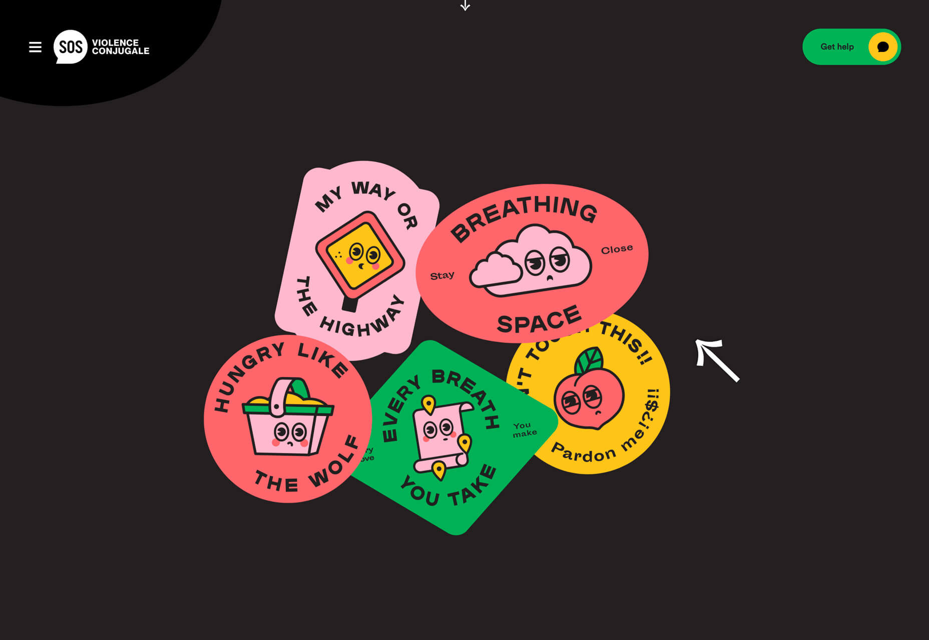
The thing that might be best about using whimsical illustrations is the personality they bring to a project. The right illustrated element – or series of elements – can emotionally tie users to the project while setting a scene. The possibilities are almost endless. Illustrations don’t have to apply only to lighthearted projects, even though “whimsical” might imply it. The illustrations for Violence Conjugale feature a sense of whimsy for a serious topic, and it works. (Maybe we all need a little more whimsy in our life?)
Black and Blue
It’s a classic color combination that’s making a big return to projects – black and blue palettes.
The contrast of a dark background and blue accents is eye-appealing and creates a harmonious and pleasing visual aesthetic. The projects below use this color trend in different ways, all with the same cool result.
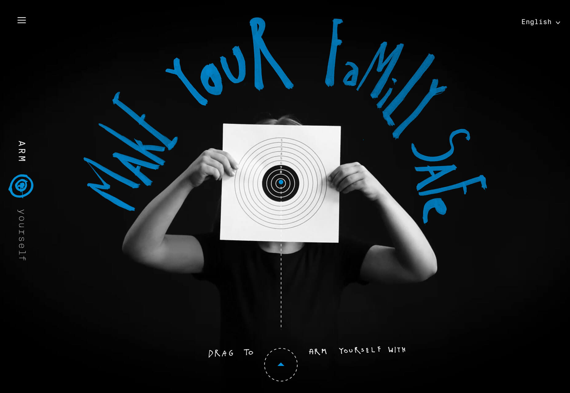
Arm Yourself uses a black background with a black and white illustration to make bright blue lettering and accents pop off the screen. Color draws users into the interactive part of the homepage design with a drag to the bullseye instruction.
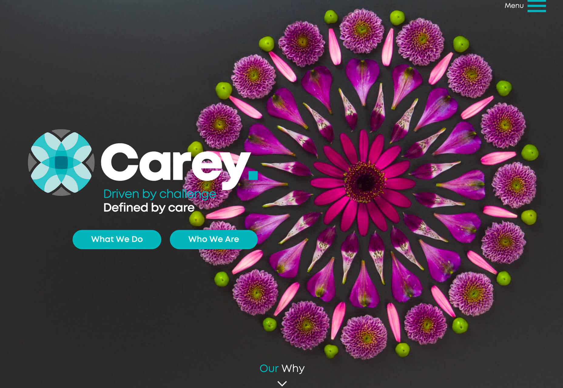
Carey uses a lighter, more teal blue on a charcoal black background for a lighter feel. The blue color pulls from the logo and brand mark with buttons that have a lot of contrast from the background and brighter elements in the design. The blue continues on the scroll with bold text on a fully black background, showing the versatility of this color choice.
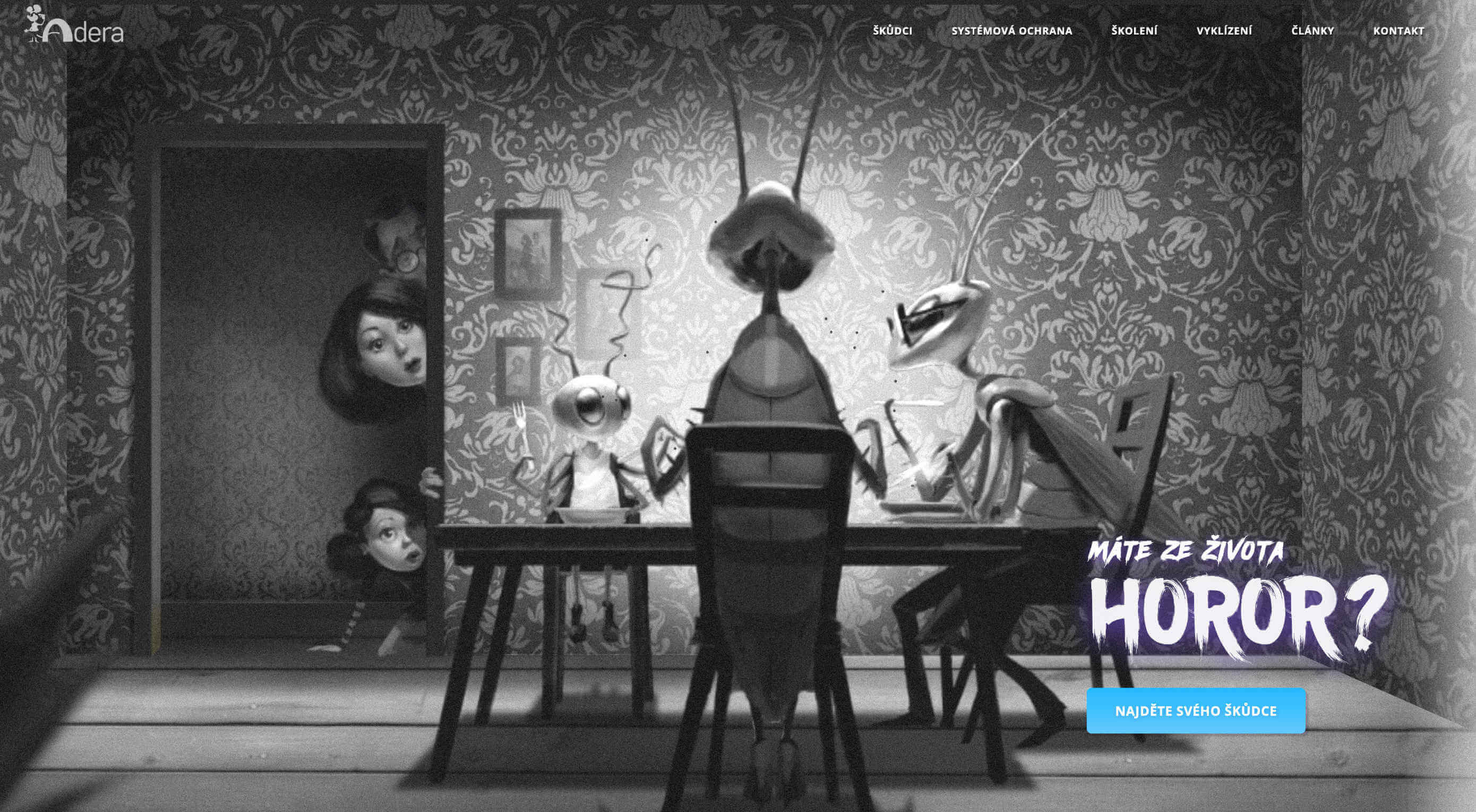
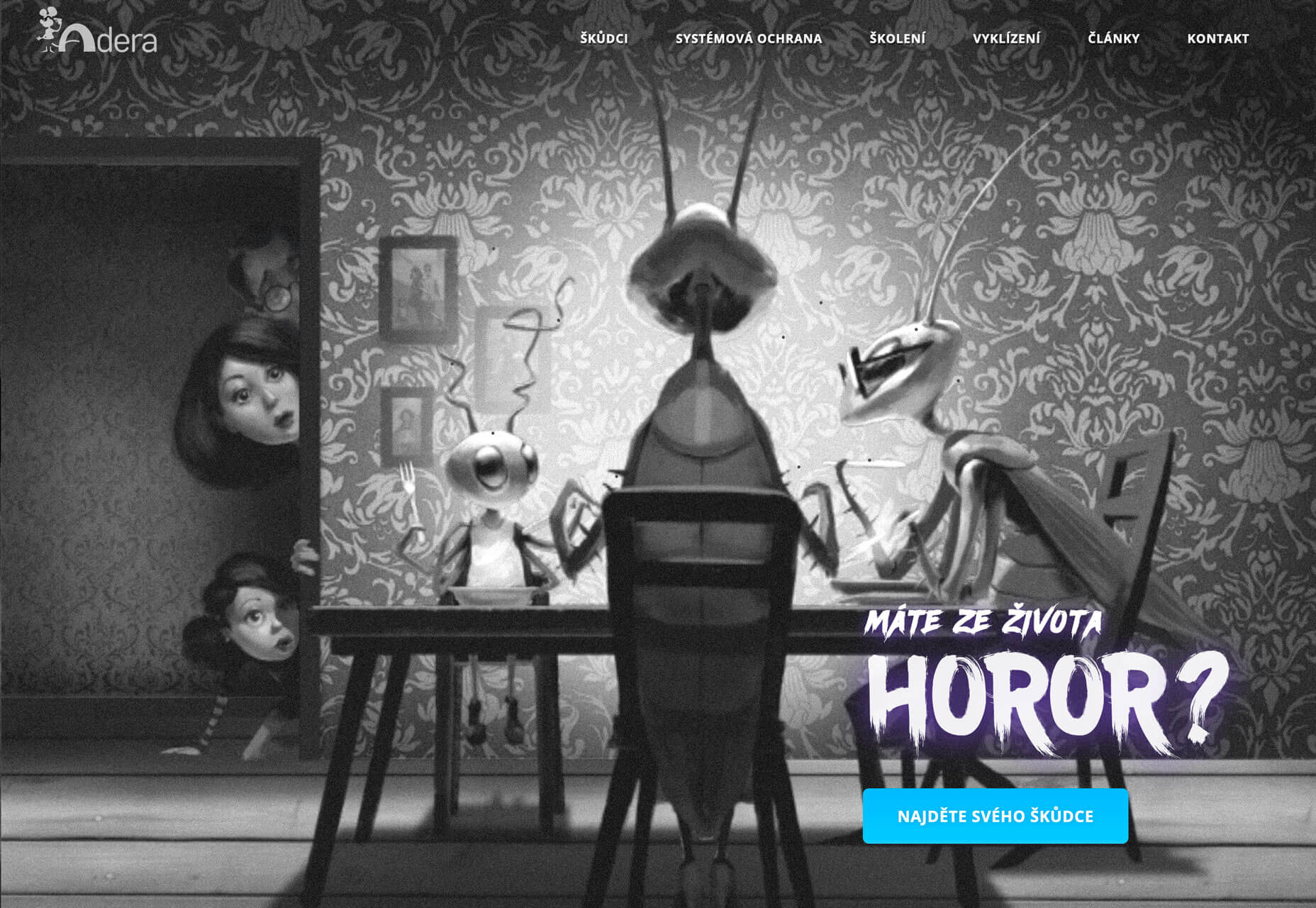
Adera uses a simple blue button on a black and white image to create contrast and draw the eye to the active part of the design. The color palette flips on the scroll to a blue background with darker elements on top. Contrast is a vital factor here, helping dictate user flow and how to digest and interact with information on the screen.
Anything-But-Flat Scroll Transitions
Disclaimer: I am totally in love with this trend and can’t get enough of it.
Anything-but-flat scroll transitions is a versatile design trend that’s visually interesting and contributes to usability. (It’s a win-win!) This trend is exemplified by a transition element between “screens” or “scrolls” with a visual that isn’t just a box or flat line. Think of how most parallax designs or screen-based vertical viewpoints advance from one box to another. With this trend the transition is more fluid. The examples below do this in different ways:
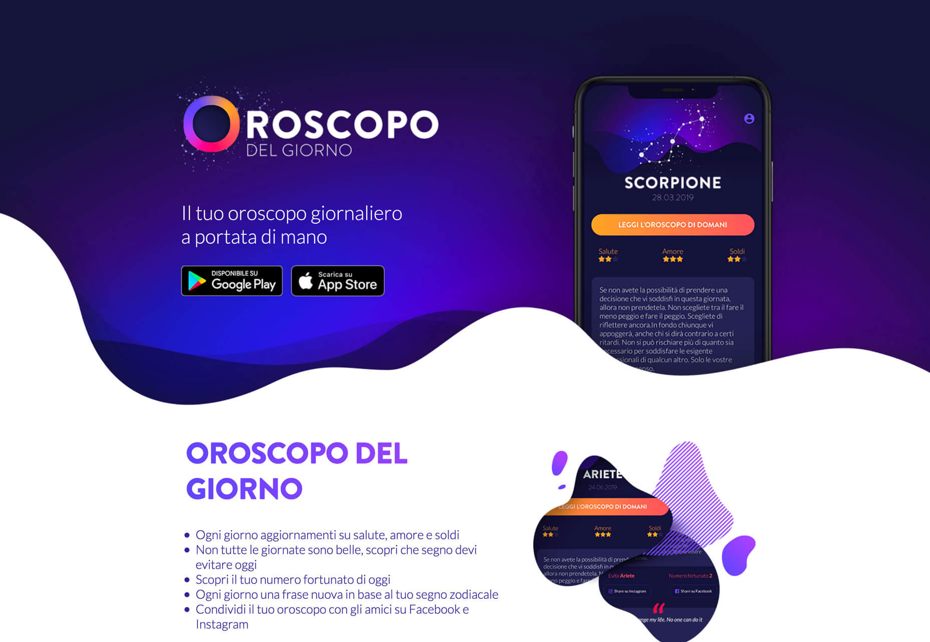
Oroscopo takes advantage of the blobs trend that’s been popular all year with blob elements that create waves between content elements. Contrast between light and dark backgrounds magnify this effect, while other blog shapes create visual consistency.
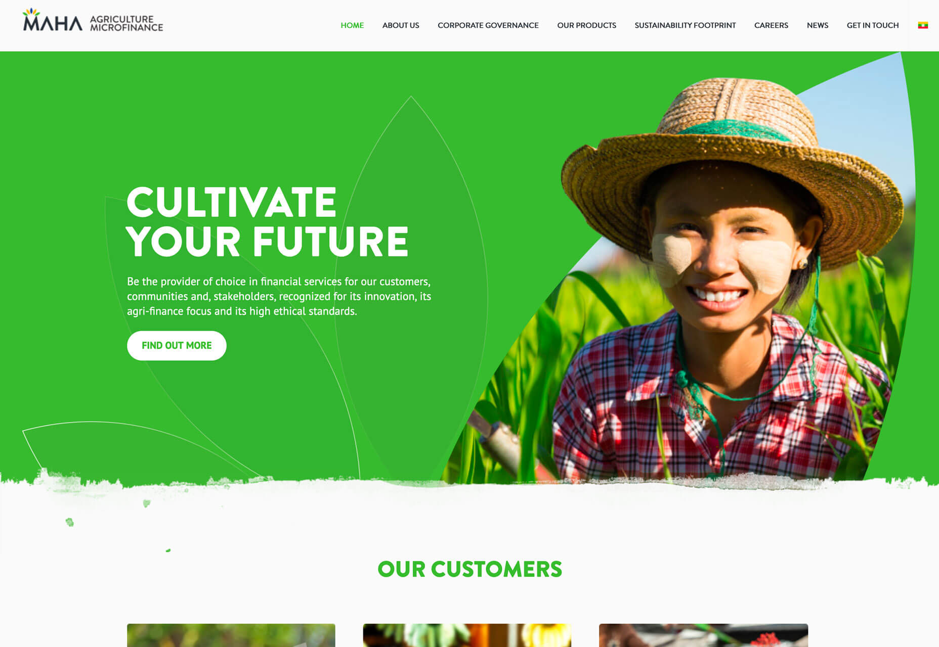
MAHA Agriculture Microfinance uses a simple line between scroll elements but it’s got a texture to it that makes it just a little more visually interesting that having a flat line between the hero image area at the top and the secondary content block.
Akaru uses a pretty amazing animated fluid design to offset the branding in the center of the screen. The animation carries into the background of the content below the scroll. (You’ll want to scroll all the way to the bottom of this one to see the transition from the dark animation back to white.) The effect is stunning.
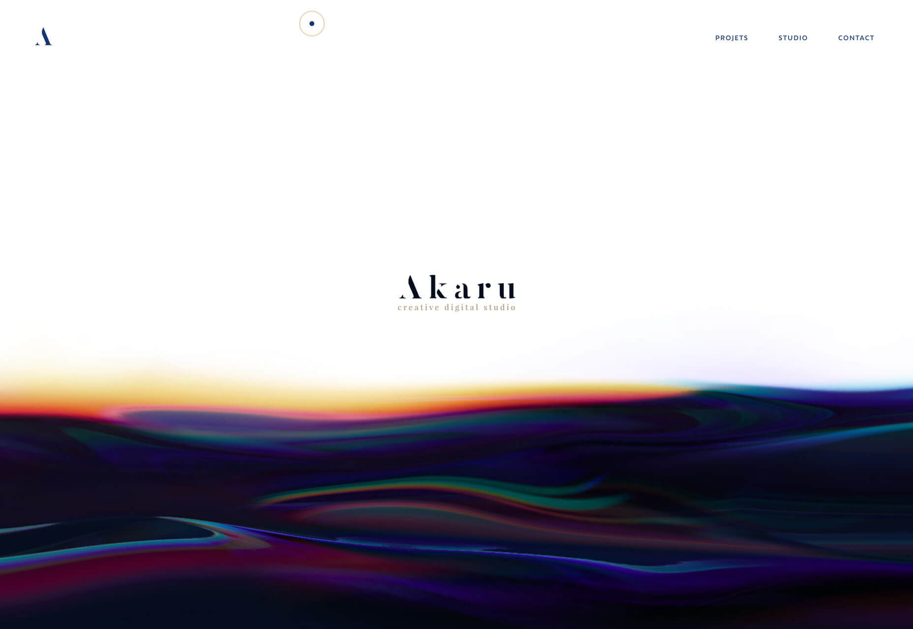
Here’s why this trend works so beautifully: The fluid transition is somewhat disruptive because the user doesn’t expect this visual and seeing the edge of a transitional element encourages scrolling. Whether the user scrolls to see how the transition changes or to preview more content is irrelevant as long as the interaction happens. It’s brilliant and beautiful, especially on desktop screens.
Conclusion
The best design trends are versatile enough that you can use them in new projects or incorporate them into websites that are already live for a little refresh.
A custom illustration can add extra interest to a hero area or page within your website, a tweak to the color palette can create a brilliant black and blue combination, or a neat transition can help users engage with the scroll.
If you want to spice up a project, these trends fit the bill for sure.
Read more: webdesignerdepot.com
Recent Comments